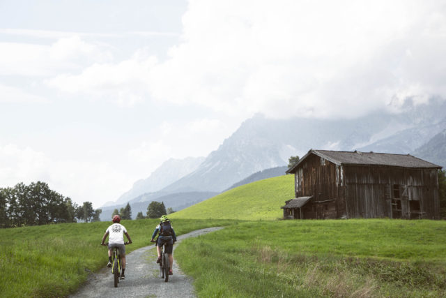
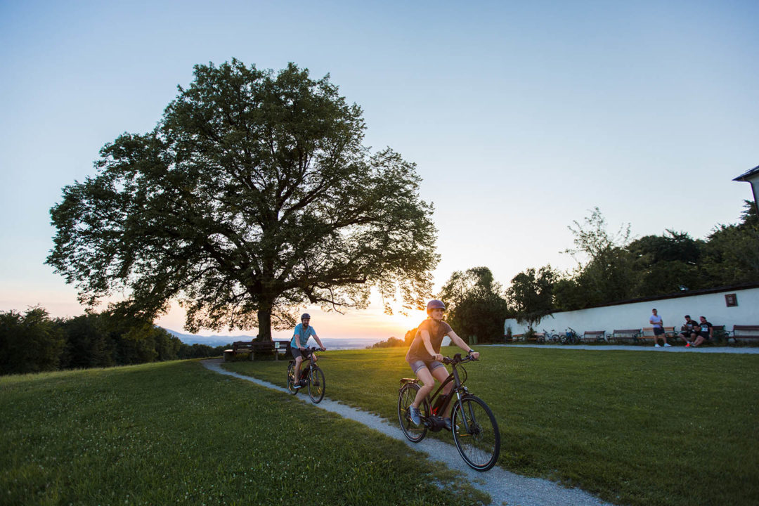
Here, biking rules – actually, Austrian biking – and there are few clients that epitomize Fargo Circle better: from influencing the direction of every product, to re-branding and re-positioning – and then we just talk bikes for the next two hours.
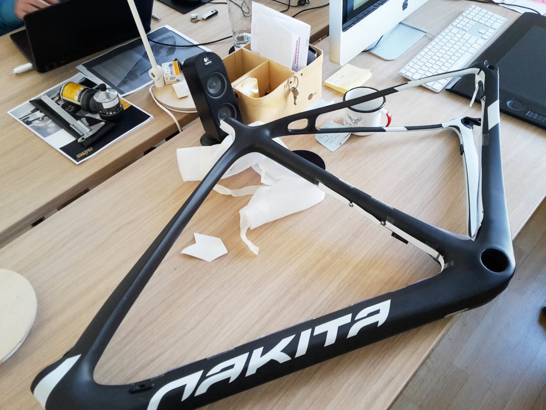
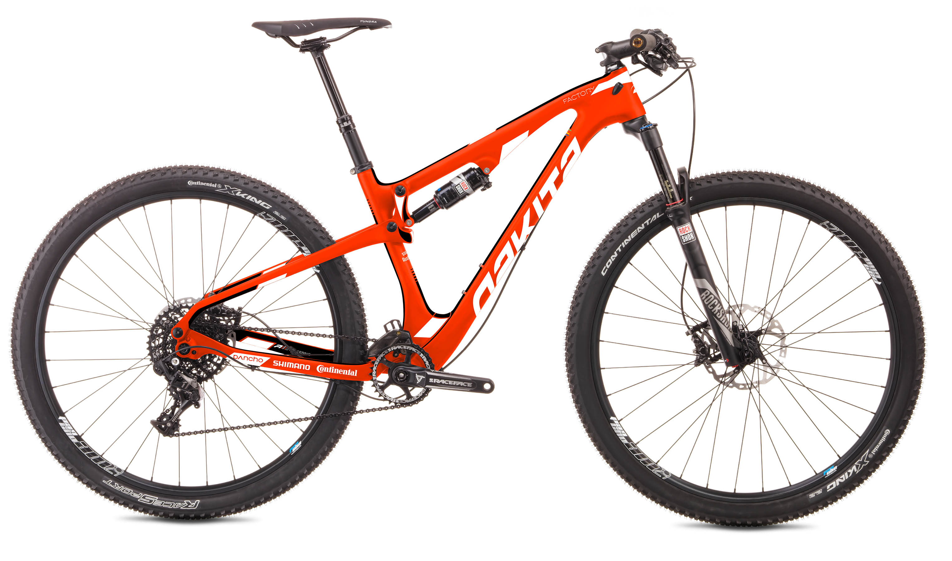
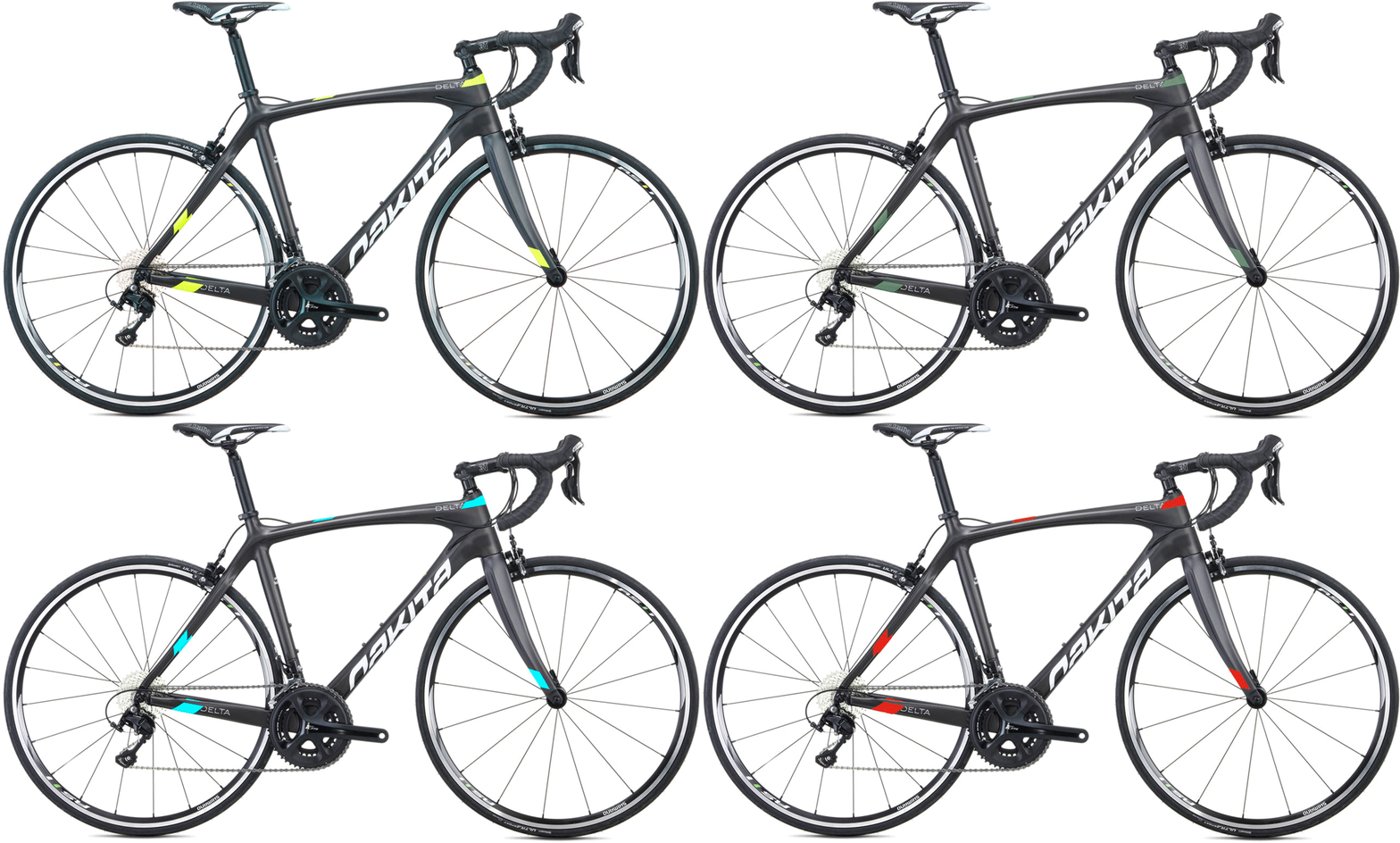
COLOR TRIM GRAPHICS
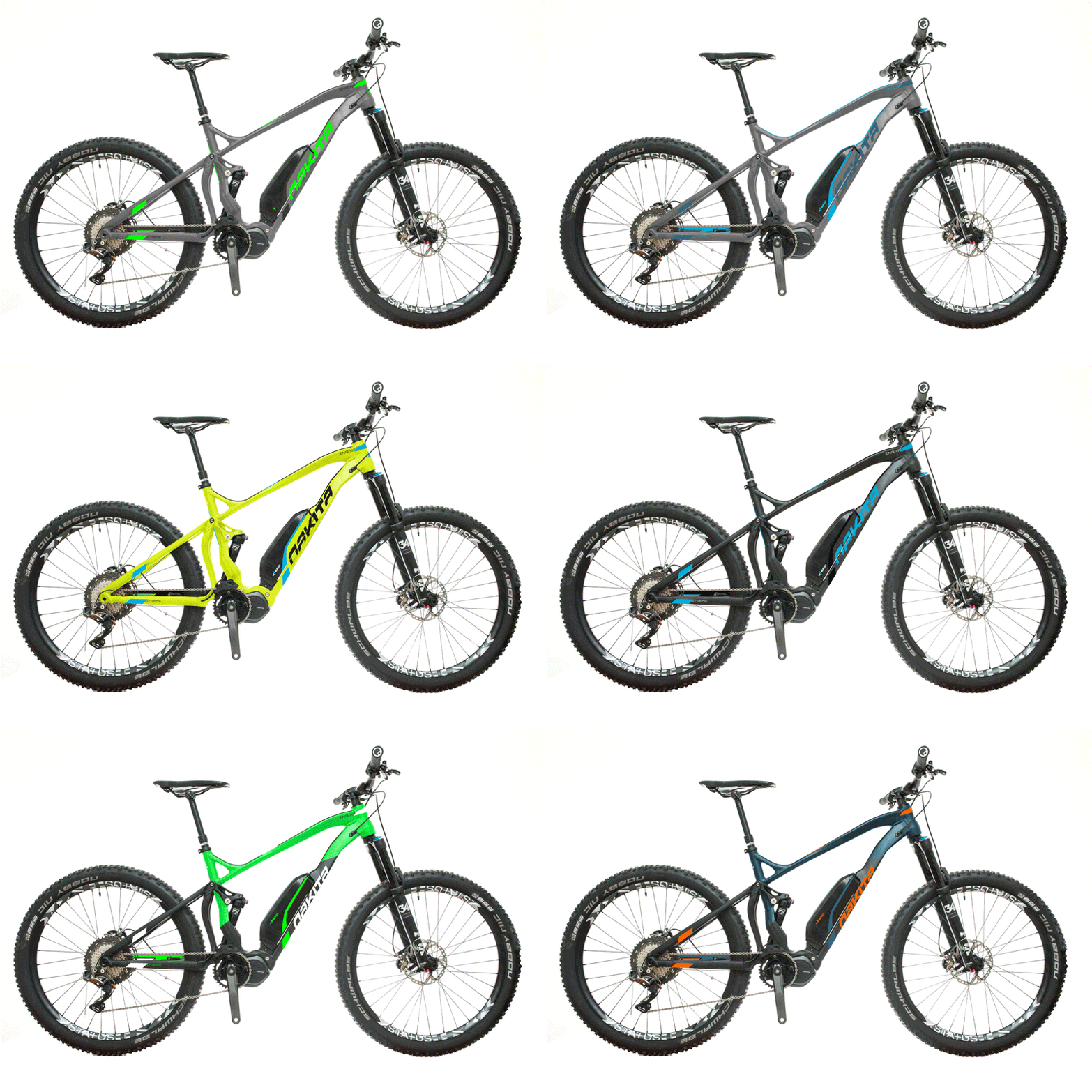
Back in 2012, we redesigned a logo, and then visualized it on the bike – it got them thinking about what else was possible. Since then we’ve been concepting colors and designing the face of Nakita Bikes on their products with our graphics. There is something satisfying and beautiful seeing one of your bikes ride past you in town. With over 80 models per year going out to market, we’ve had our hands full – literally.

EXHIBITION DESIGN & EXECUTION
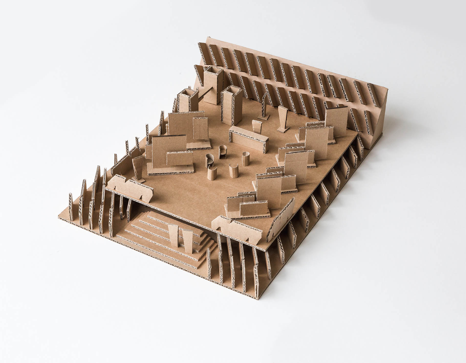
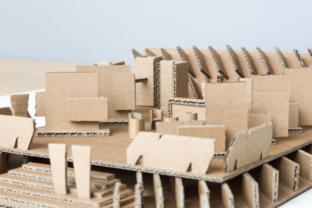
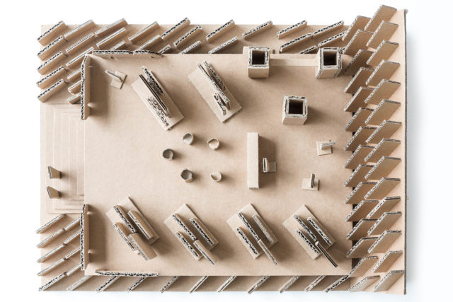
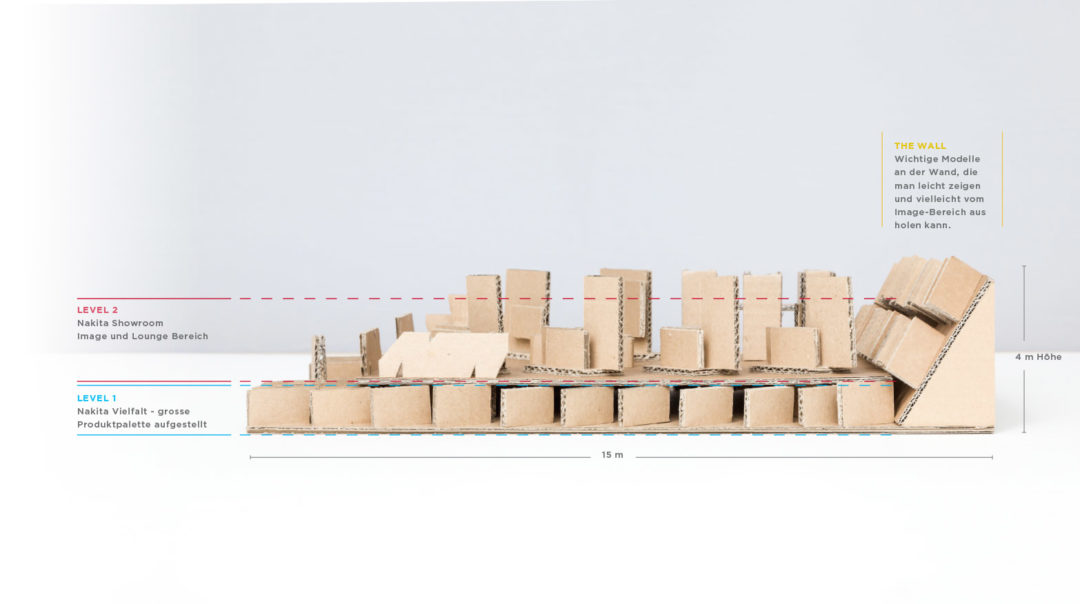
FROM 2D to 3D
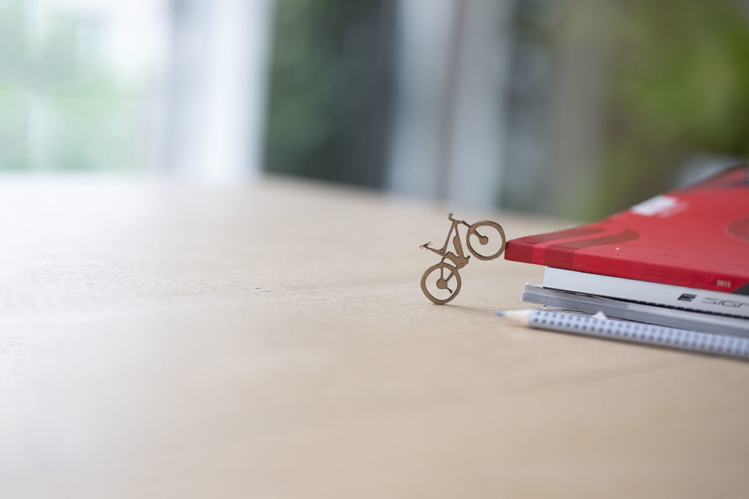
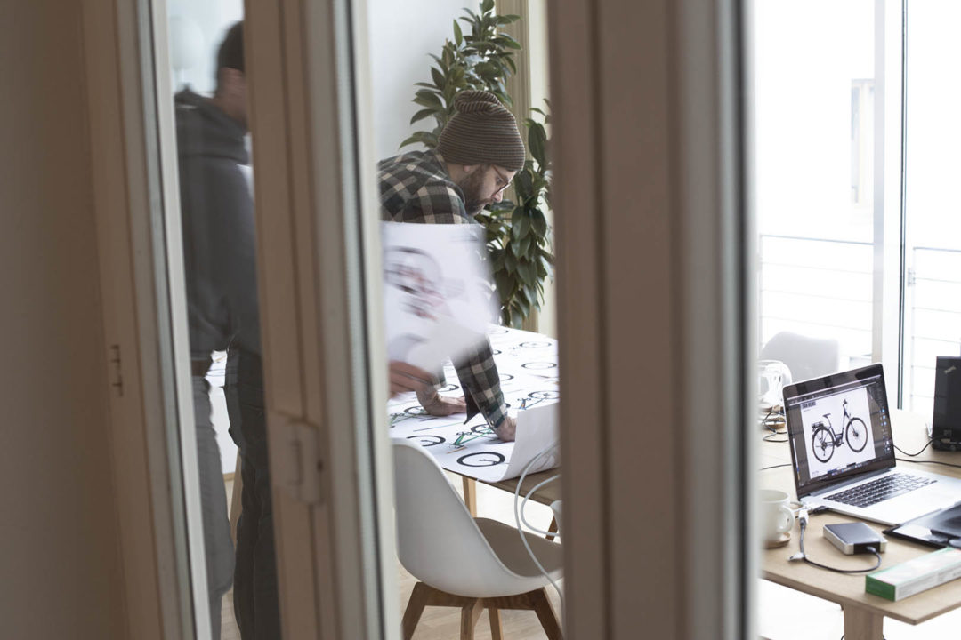
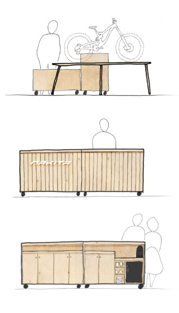
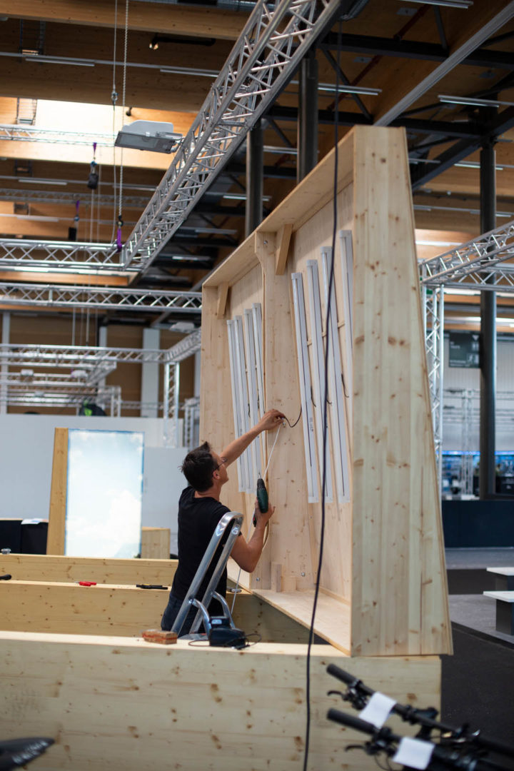
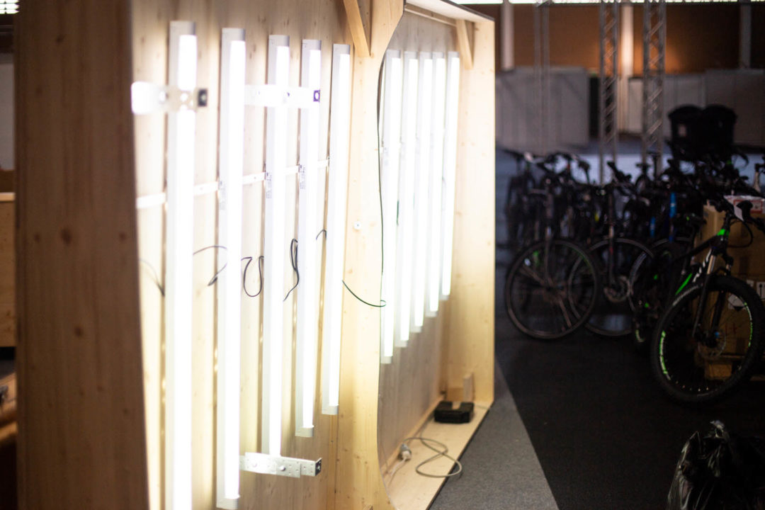
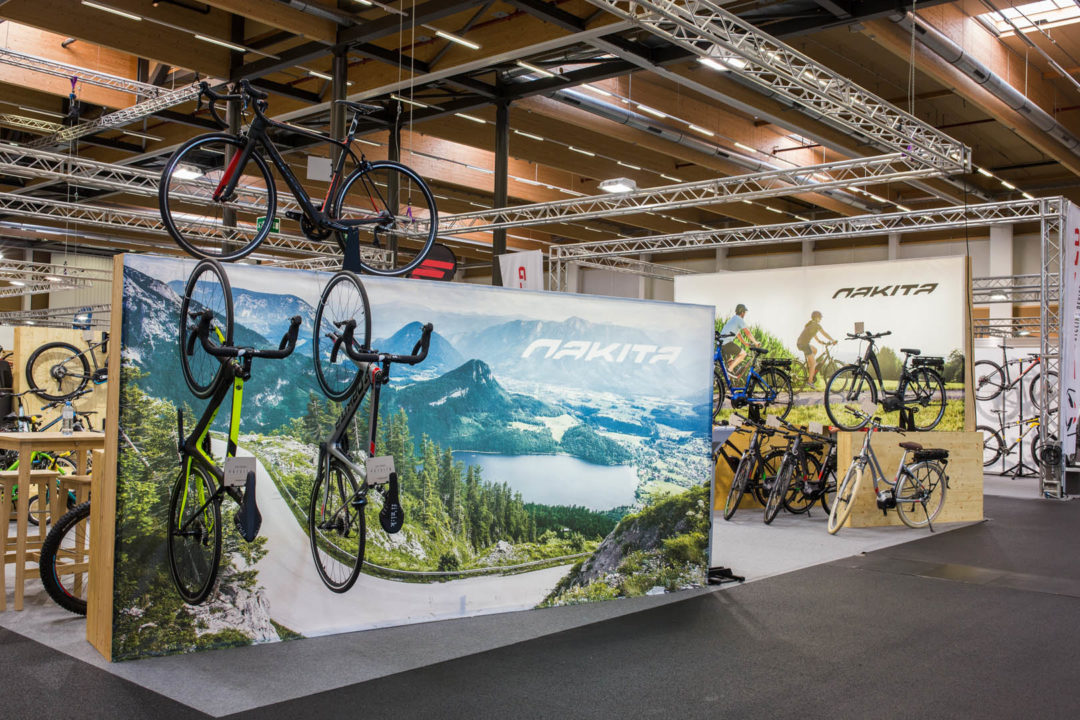
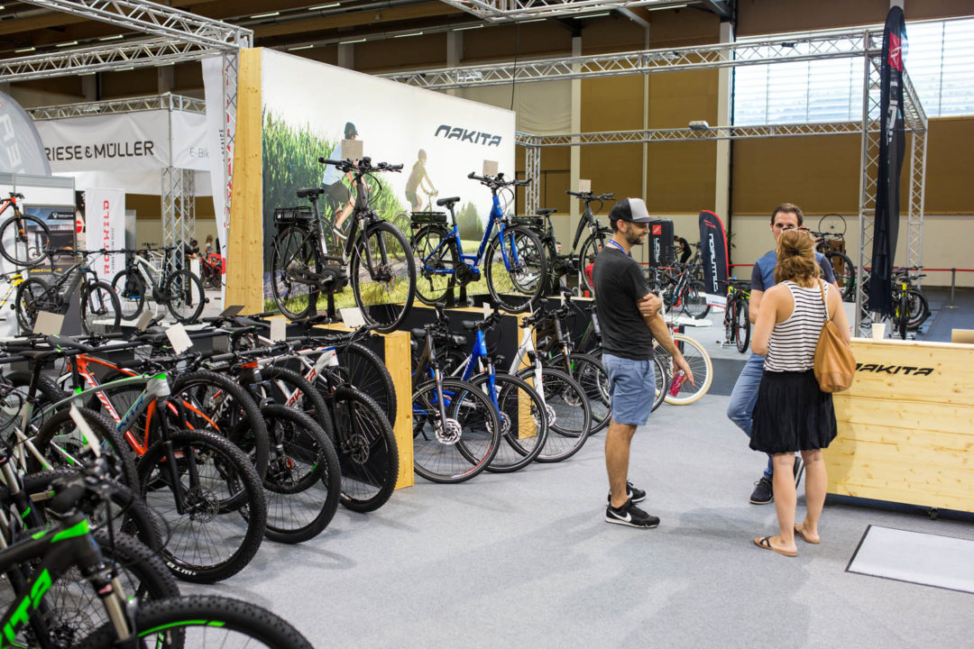
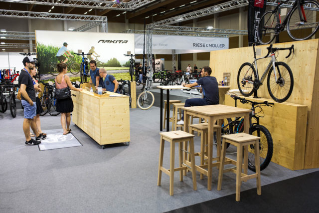
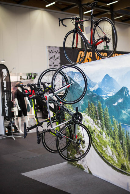
When you need to think big, and think smart, why not get the best people on board? Together with our architect and exhibition extraordinar Warren, we proposed concepts that would gain Nakita a lot of attention at the expo. Complete with miniature cutout models, we up-cycled existing bike stands into lightboxes, shelves, tables and display units.
BUILDING DAY
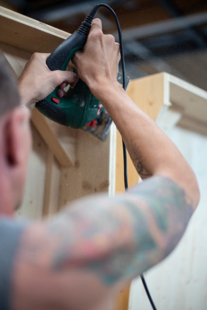
It was no small task to retrofit existing wooden blocks into a cohesive concept, but Warren, the Nakita guys, and our mini crew hammered, sanded, measured and mounted.
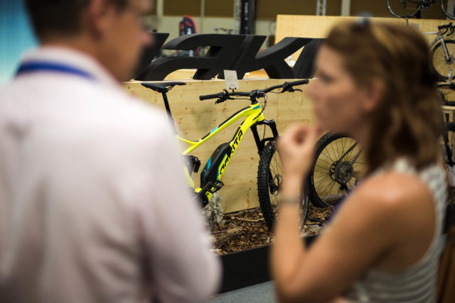
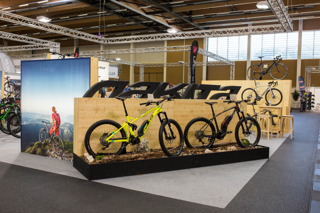
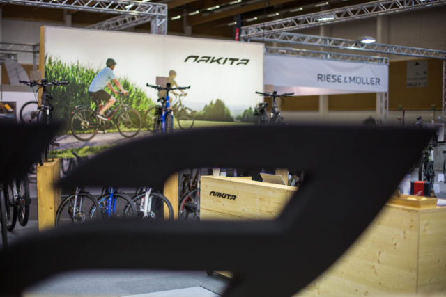
FINISHED PRODUCT
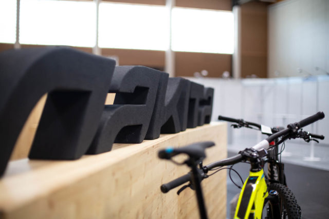
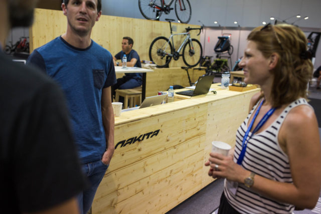
We were happy with it. And Nakita was more than happy with it, and we were all very proud that we could retrofit existing material and build something completly fresh for the client with limited budget. It was most definitely aesthetically superior to everything else there at the expo, so that counts for something, right?
EVENT CONCEPT
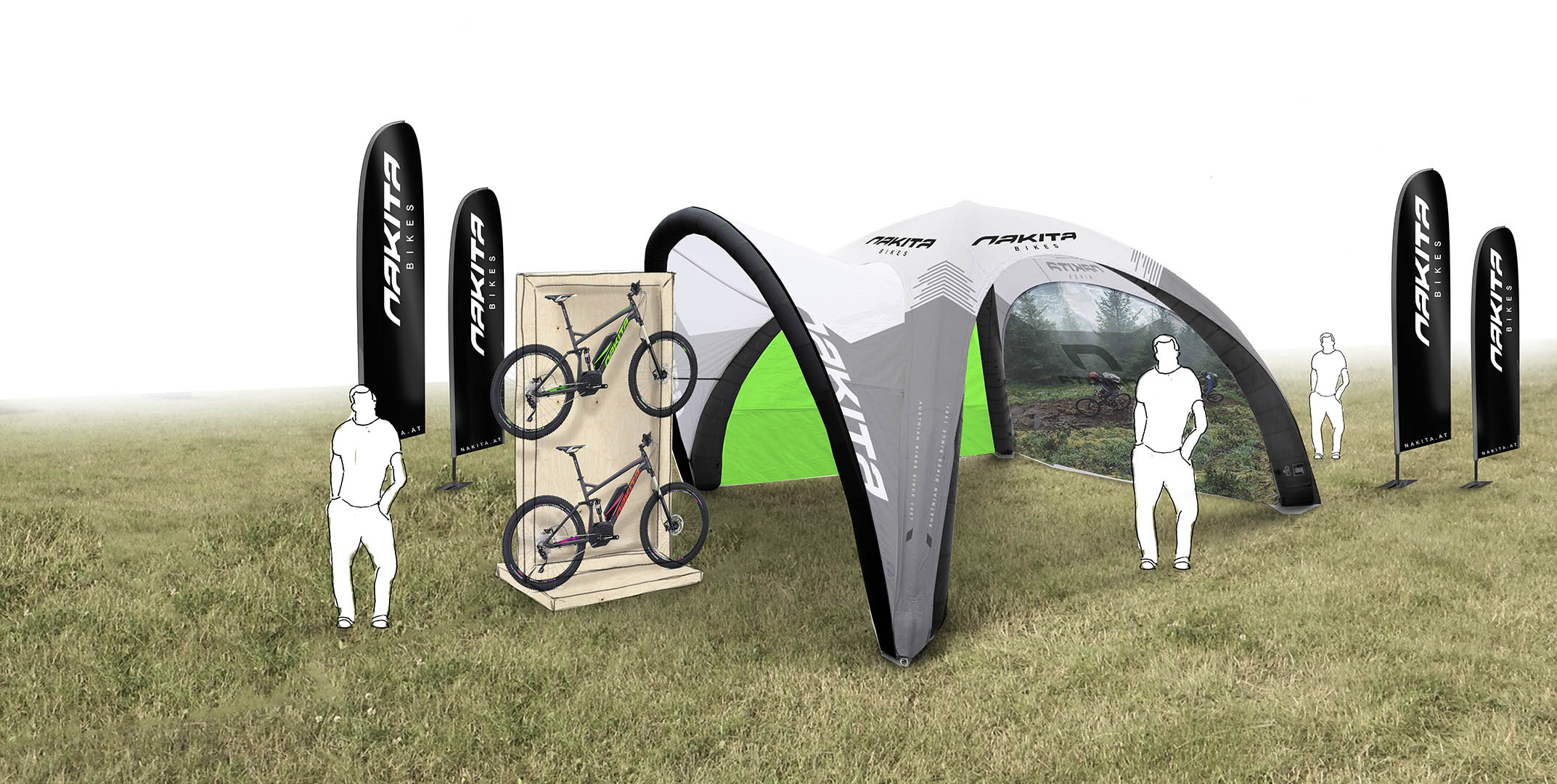
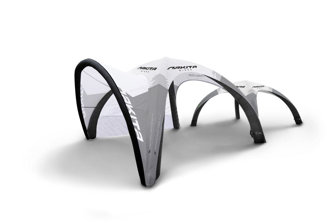
Modular Event Branding
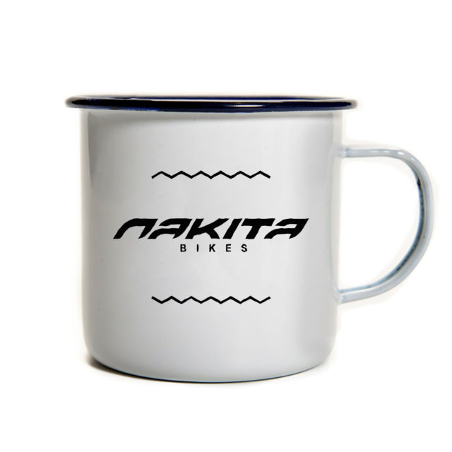
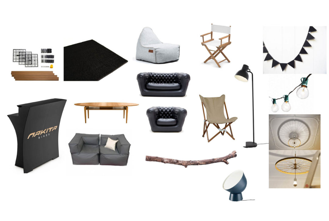
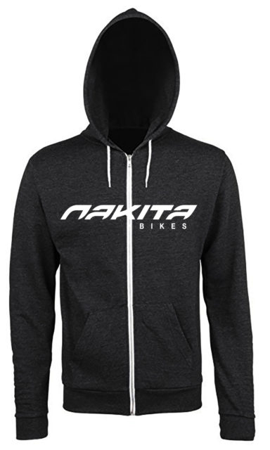
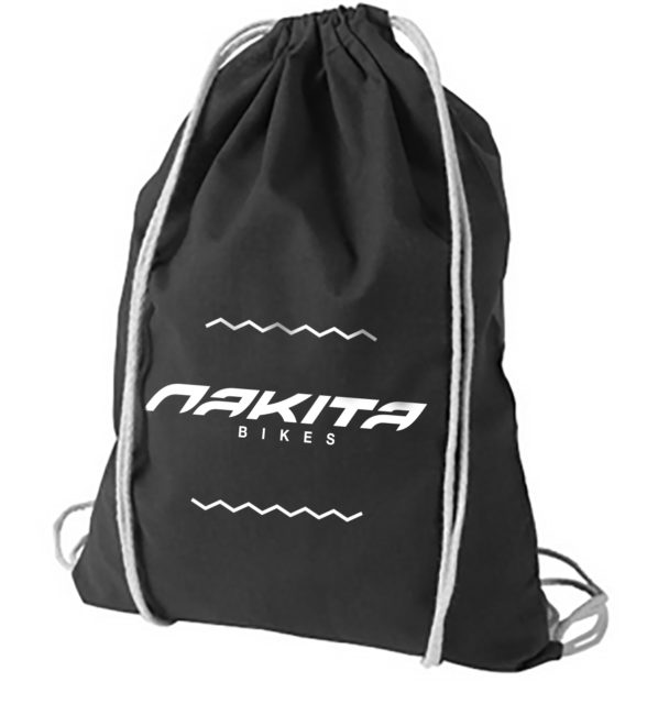
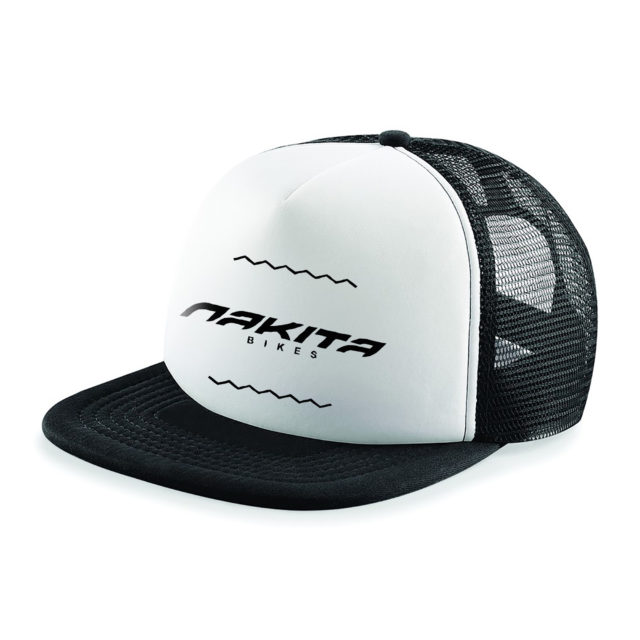
Traveling tent design concept, visualization and execution, complete with interior design concept & execution, sourcing and purchasing. A merchandise package was developed, offering some nice takeaways for sponsored riders and brand ambassadors.
